The next section that needs to be done for the map is shown below. It extends over the next sheet, K.26e - Czernowitz:
The reader can see the background has shifted, so that all the labels are turned 60-degrees clockwise. The time has come to explain why. Before reading this, you may want to familiarise yourself with this very old post.
Have a look at these two 20-mile map sheets:
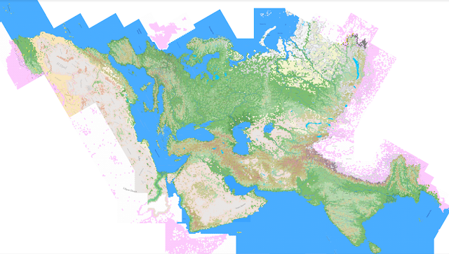
This represents most parts of the world that I've mapped in 20-mile hexes. I had a large part of China done, before (I believe) accidentally deleting the files; some of Mongolia has been done, and a big part of Africa south of the line shown. The reader can clearly see how the curve of the Mediterranean twists into the levelling of the Black Sea (assuming you know where these are without needing labels), or how India twists towards the right as it approaches the 90th meridian east, where the map turns again into Burma.
This would bother some people. You may note on the comments connected to the link above, to the old post, that a number of people have firmly suggested putting the map on an actual globe. Of course, there are two big problems with that. First, it's very difficult to fit the globe into a scanner, so it can be put online ... and two, none of the pundits suggesting the globe idea have done anything. Nix, nada, nothing. This may help explain my contempt for pundits in general. Full of ideas, shit for making something.
The map turn is a bitch, no question about it. Usually, a rectangular sheet map, like "Carpathians" above, always overlaps adjacent sheets by just two hexes, such as I demonstrated here (see bottom of post). The "corner map" overlaps considerably more, to ensure I have complete coverage, as shown:
When I make a corner map, this is the template I use. The orange line represents the parallel, say the 30th E, that dictates the turn taken. The blue line follows a row of hexes, showing that as we move from west to east, we simply turn the roads in a new direction. In a few weeks, you'll see this done and be amazed at how perfectly simple it is ... and how the result is undetectable at a close-up scale, even at 20-miles per hex. The "overlap" shows how much of the Carpathians map folds over the Danube Mouth map ... thus we can see the turn of the Carpathian mountains, represented by brown hexes, on both maps, even though the Danube has them turned 60 degrees. Finally, the bottom left of the map ends up extending deep into the ring of maps below. Carpathians and Danube mouth are the "D-Ring." The "E-Ring" appears on the Carpathian maps only as the bottom two hexes ... but the corner hex sucks up a great deal more of the E-Ring. That's why we can see part of Thrace showing up on the Danube Mouth map.
This repetition of maps, so that both sheets are duplicates of the other, is an enormous headache. They have to be nearly perfect as well, or else I could not put them together to create a single, great map, such as the big map of the world shown above. Unfortunately, Publisher as a program ffing won't turn a picture 60 degrees without distorting it a tiny, tiny, tiny bit. Just enough to grind my teeth.
So, as we move towards the 30th parallel (we're at the 26th), the distortions between the map being made and Google Earth increase, ever so slightly, and never in a way that can't be tolerated. Then the overlap has to be compensated for. And then, as we move away from the 30th, the map becomes less distorted and from thence forward, there's only a hassle when the 30th is actually approached and crossed. I've already done enough work that the main center of the whole 6-mile map I've done is past that overlap. Wasn't much fun, I can tell you.


No comments:
Post a Comment
This blog is moderated. Stay on topic.